Portfolio Jamak
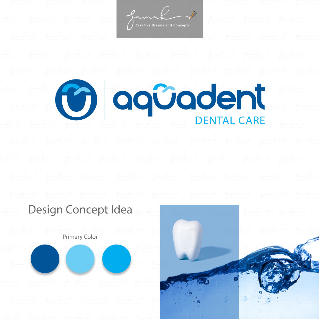
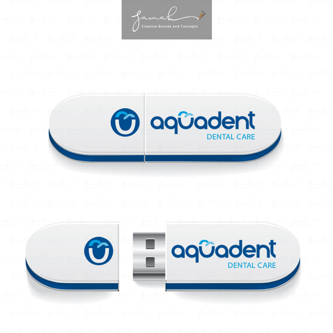
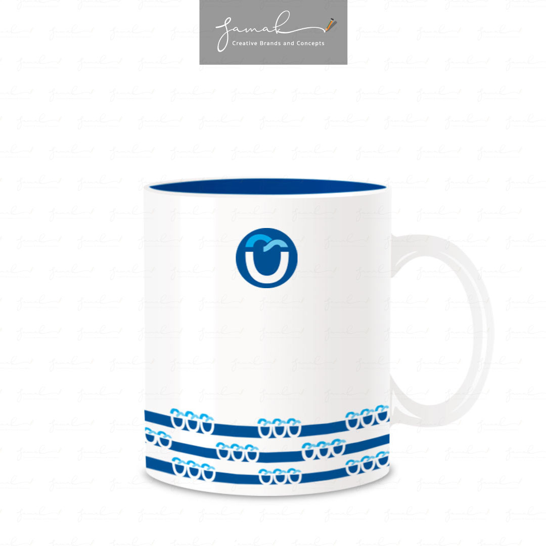
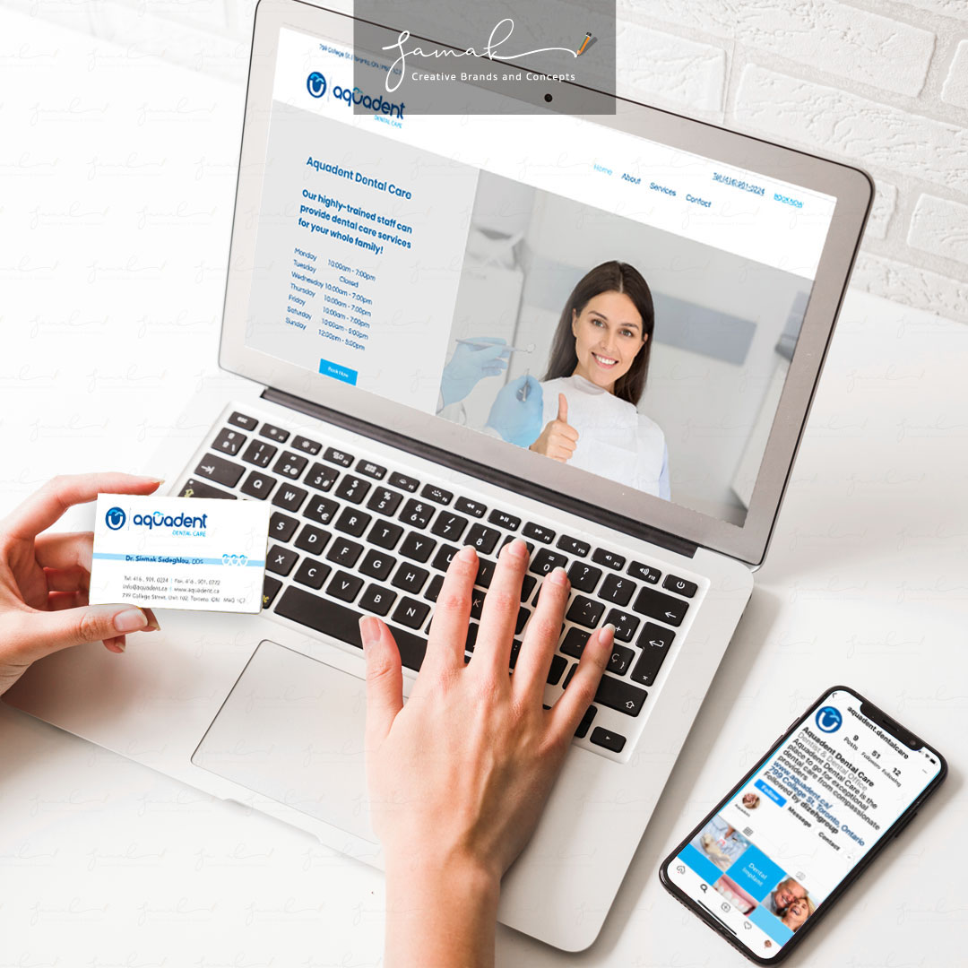
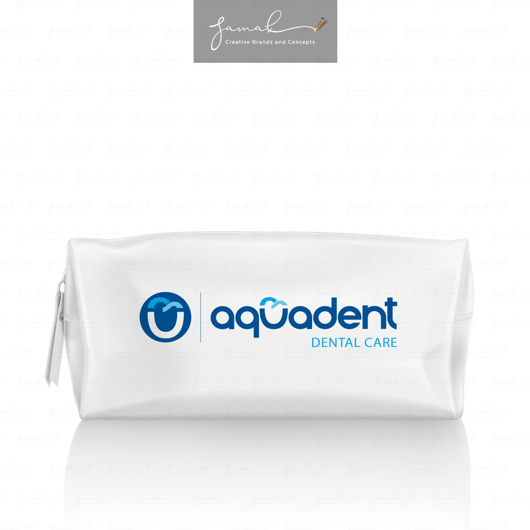
Aquadent Dental Care
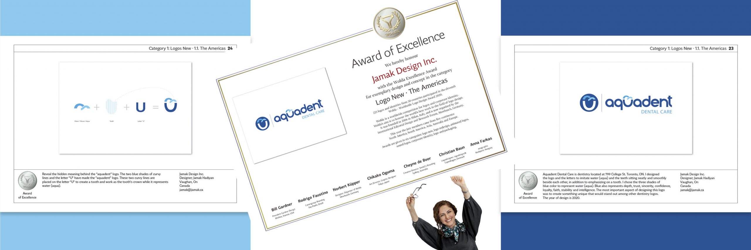
Aquadent Dental Care is a dentistry clinic located at 799 College St. Toronto, ON.
Aquadent Dental Care

I designed the logo to imitate water (aqua) and the teeth sitting neatly and smoothly beside each other, in addition to emphasizing a tooth.
I chose the three shades of blue to represent water (aqua) and waves. Blue also represents depth, trust, sincerity, confidence, loyalty, faith, stability, and intelligence.
The hidden meaning behind the Aquadent Logo
This logo’s first appearance is simple, and yet you can see the blue waves represent a symbol of water (aqua). If you look at the space between the letter “U” and the waves, you can also see a tooth.
The most important aspect of designing this logo was to create something unique that would stand out among other dentistry logos.
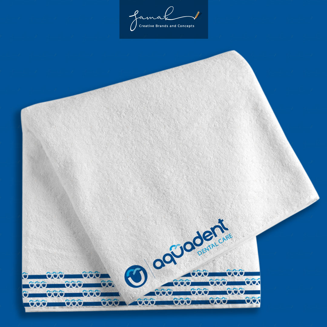
Aquadent Dental Care Graphic Pattern
The Aquadent graphic pattern has been made by repeating the letter “U” with the top waves horizontally to create an illusion of water (aqua). The graphic pattern can show up on many items to keep the brand consistent.
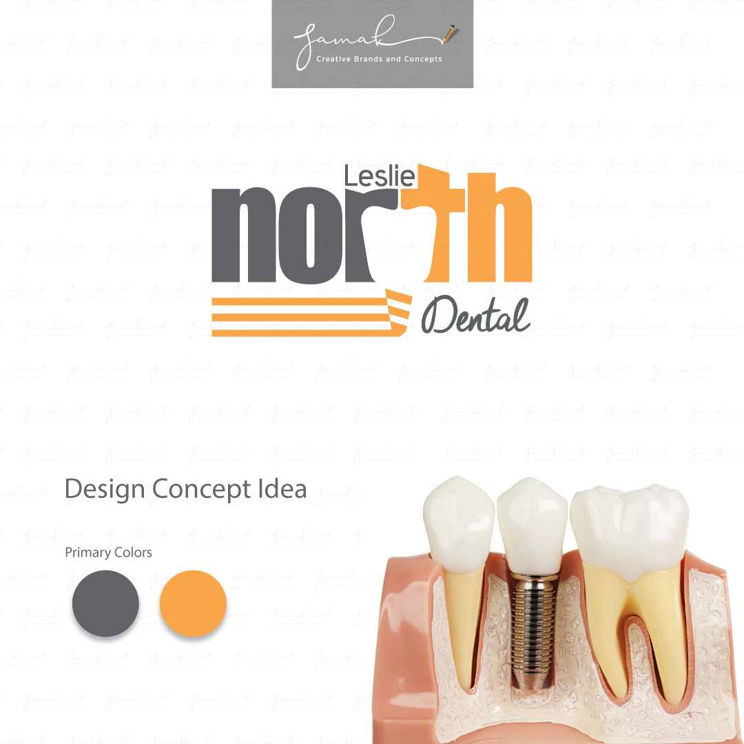
Leslie North Dental Clinic
Leslie North Dental Clinic is a specialized implant clinic that is located in Newmarket, Ontario, Canada.
Leslie North Dental Clinic


Logo
The space between “R” and “T” makes a tooth. It is an advantage of the name that you should grab. It is entirely different from other teeth clinics that are specialized in implants.
Video
Choosing an animated logo can be easier for the patient to remember.
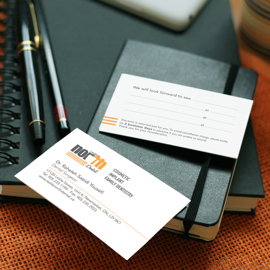
Business card
Having the correct placements of objects on the business card helps visualization.
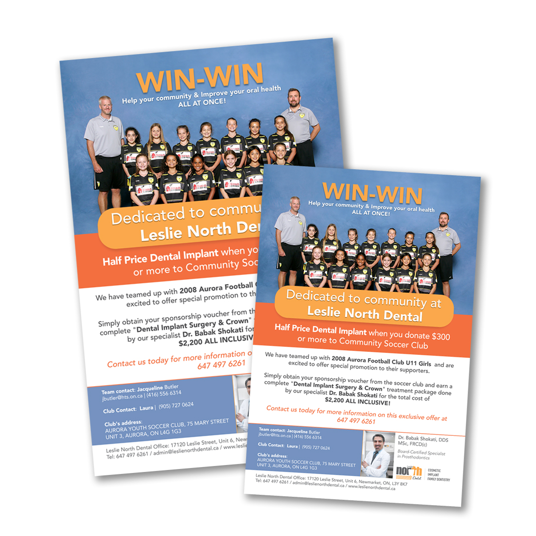
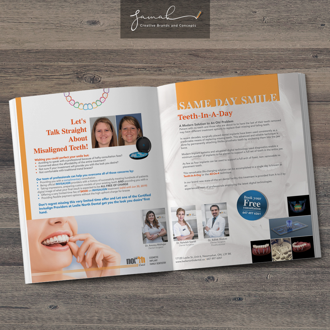
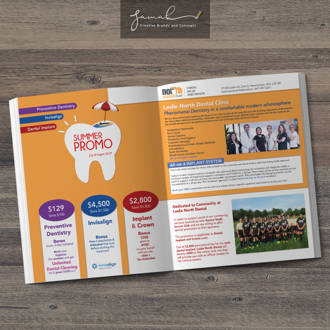
Magazine
Knowing who the business target market is while giving them the feeling of happiness and calmness by selecting the right photo and colour harmony wins the game. This magazine cover has gotten more than 15 patients in the first week of opening for the new implant clinic in Newmarket.
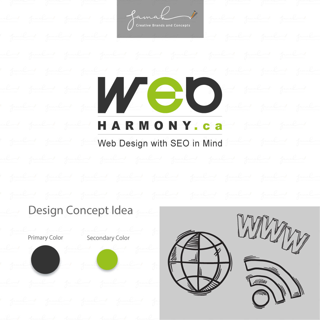
WebHarmony
WebHarmony inc. is a Canadian web design company.
My client needed a logotype as an identity that represents the company’s message. I came up with the logotype with a central focal point for a web design company.
I emphasized the letter “e” as a focal point to represent the connectivity of the internet world.
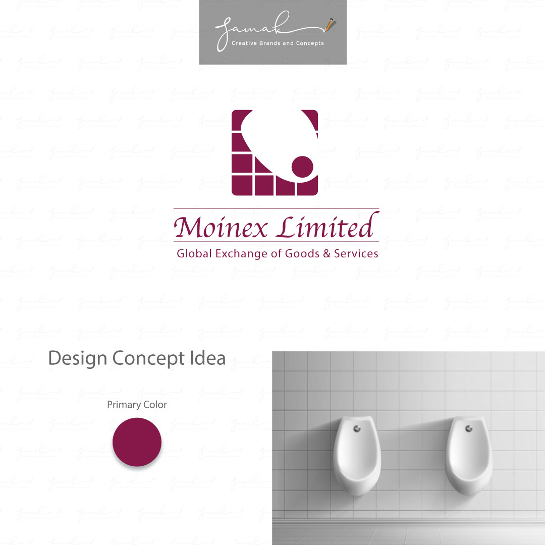
Moinex Ltd
Moinex Ltd is a trading company
that imports tiles and sanitary ware based in Canada.
The brand identity came from tiles,
bathroom sinks and toilets, and bath tops.
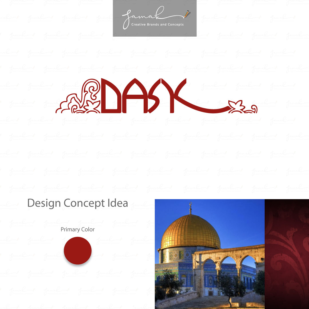
DASK
Architectural and interior design Company based in Palestine.
Because of the company’s unique name, we decided to have a logotype as the identity. The design concept came from the Arab architecture style—the Color of dark red (burgundy) representing the luxury colour in the Arab world. Supporting design (Slimi art) was added to the company name to emphasize Islamic art for interior design.
Alfazed Studio
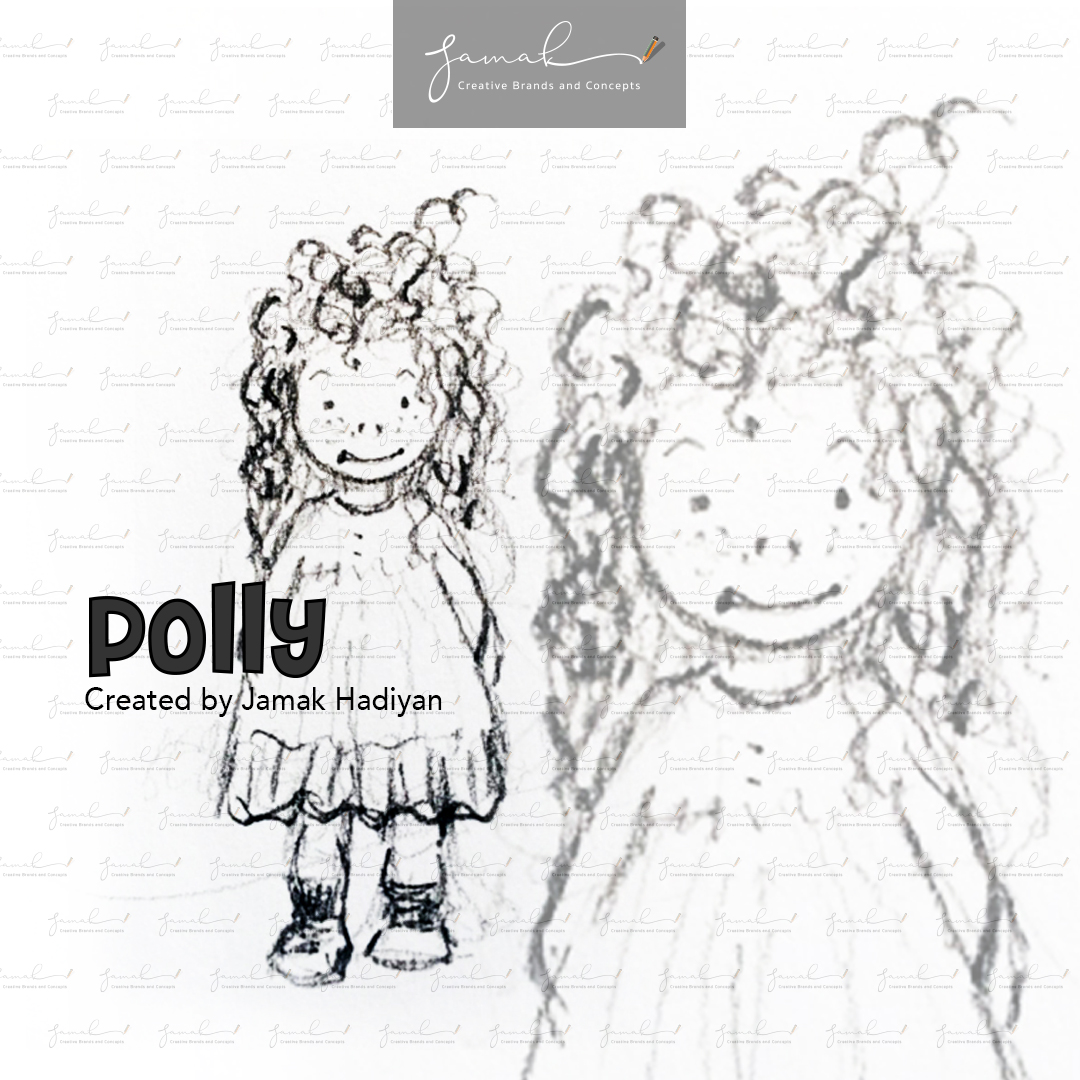
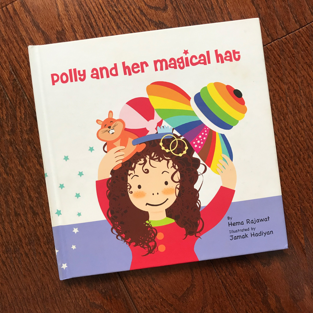
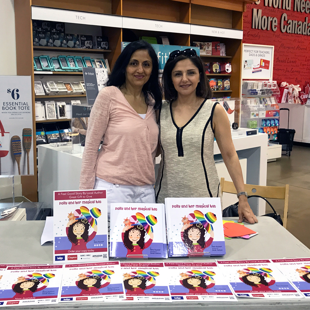
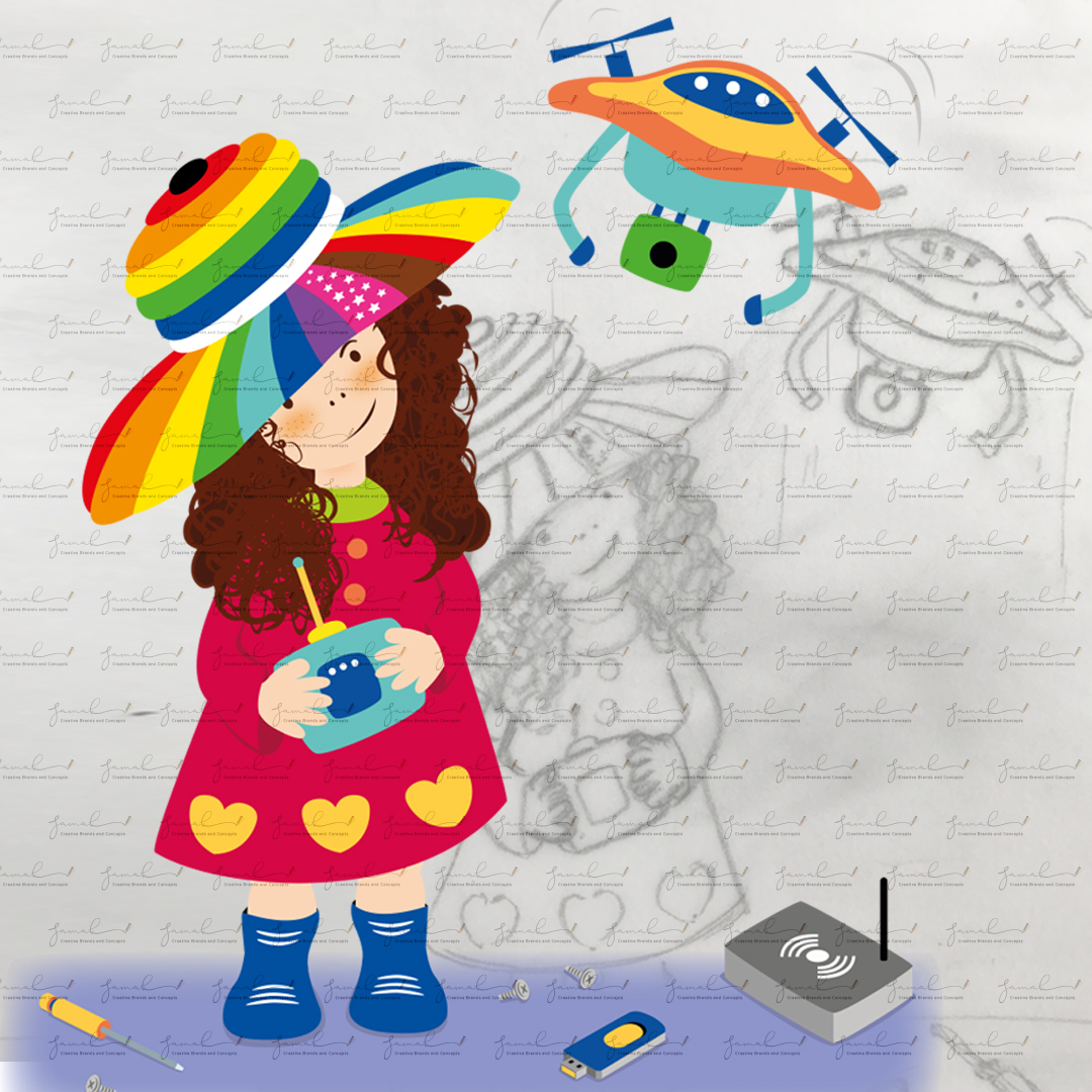
Jamak illustrated the children’s book, Polly and Her Magical Hat, which was written by Hema Rajawat. And she created the lovely main character, “Polly.”
AB Farms Corp.
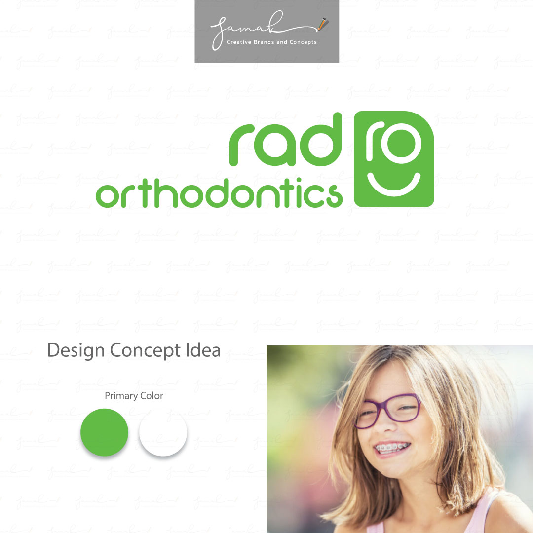
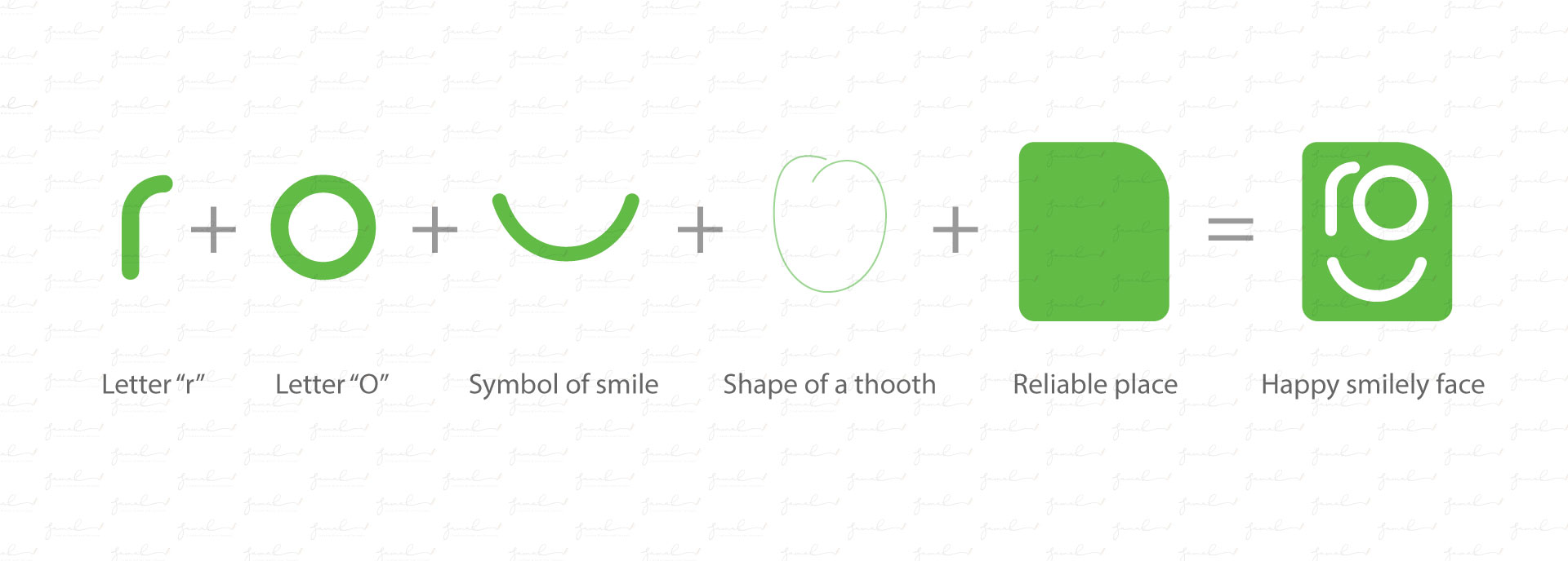
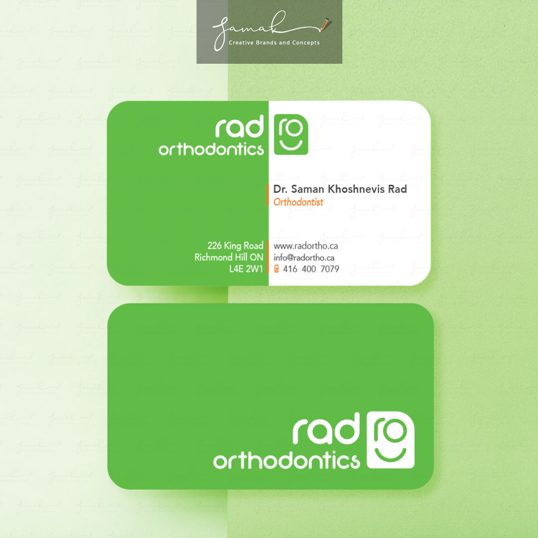
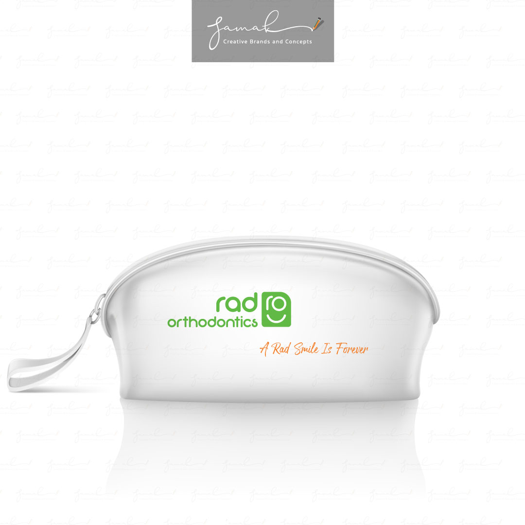
RAD Orthodontics

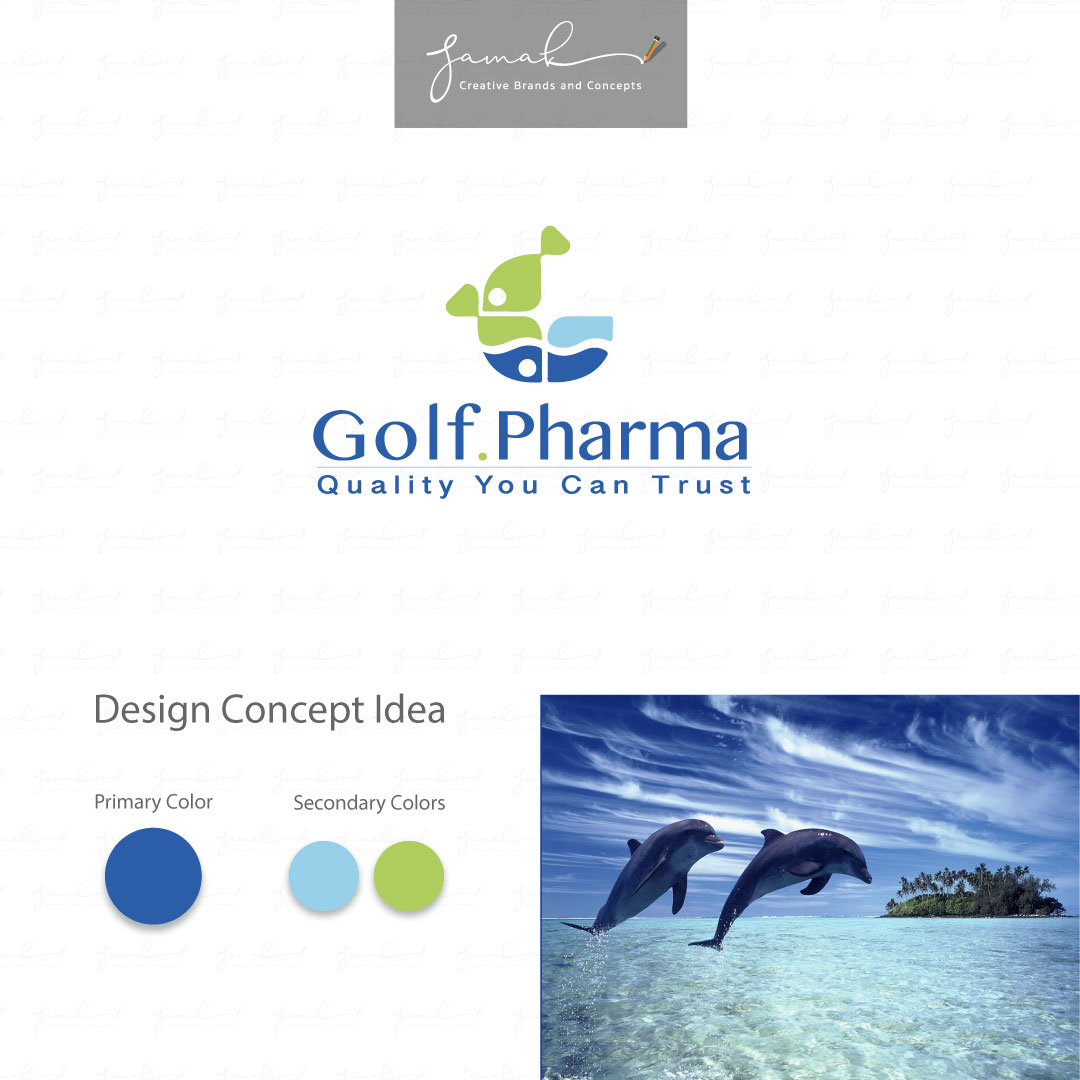
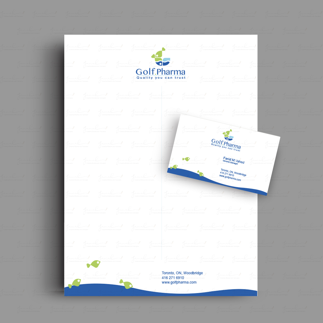
Golf Pharma
Golf Pharma is a pharmaceutical company with the main import of fish oil omega 3. I designed the brand identity that represents organic products that came from fish. Water showed the base of nature, and the green fishes represent organic omega 3. Why green fish? Because the green colour emphasized freshness.


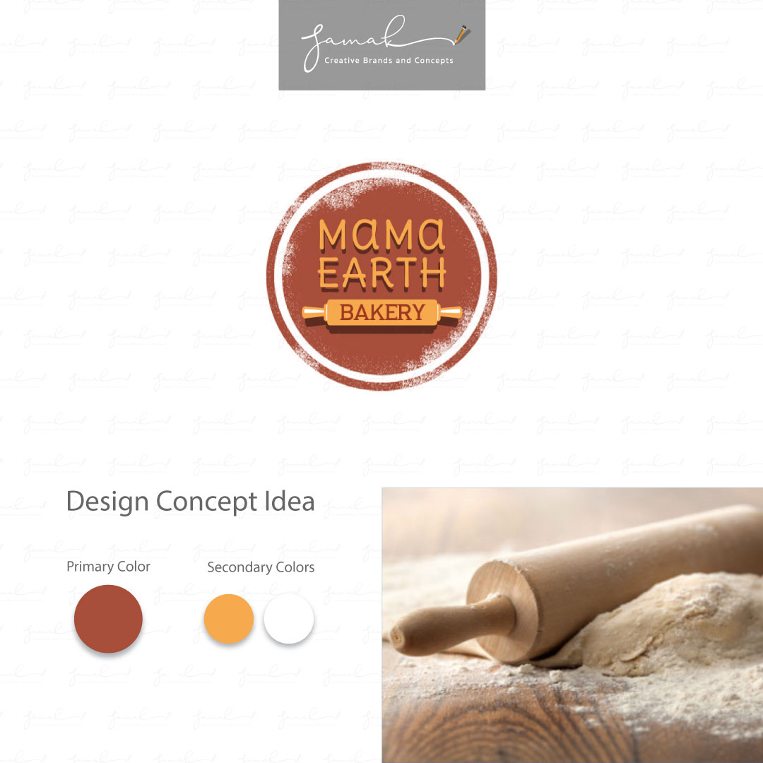
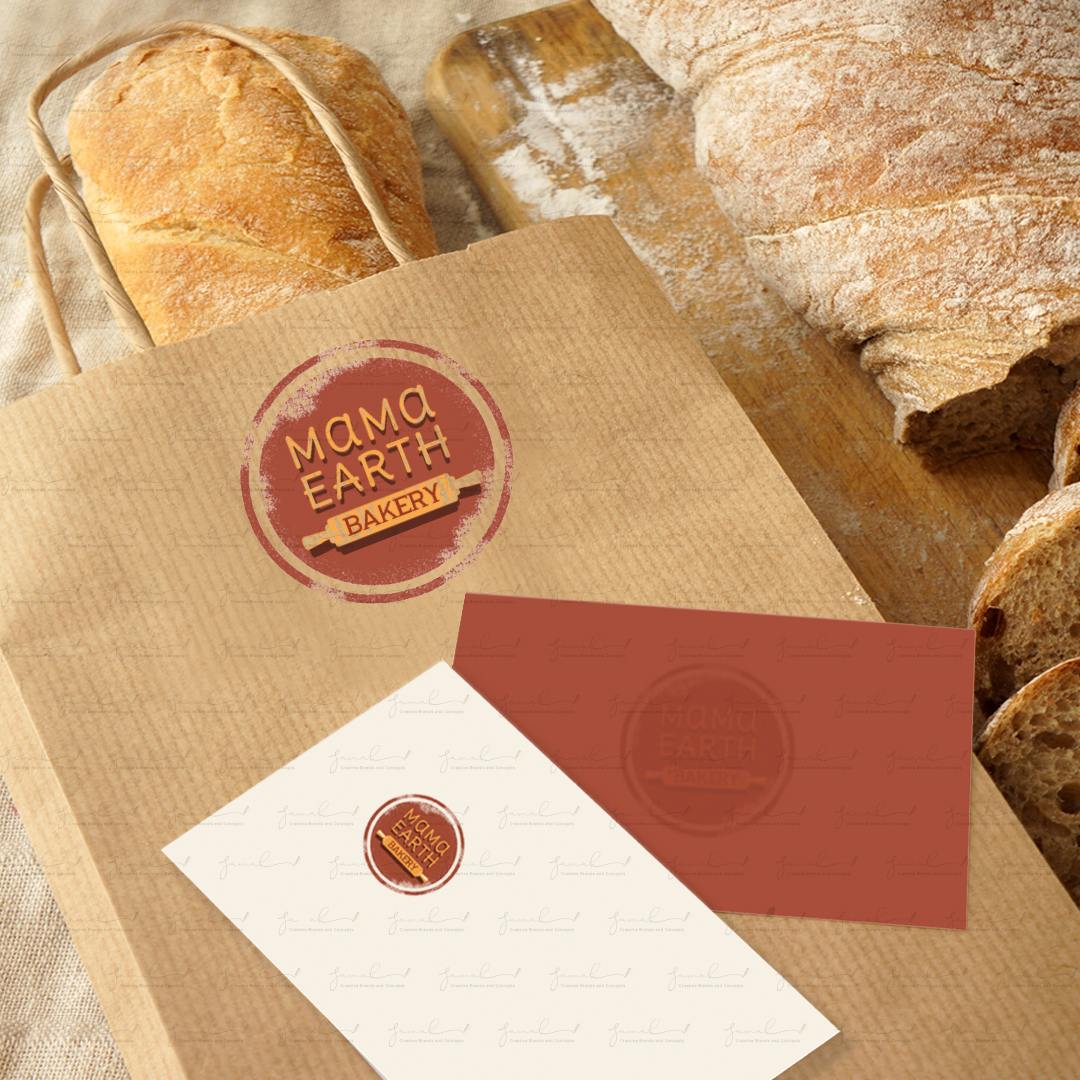
MAMA EARTH BAKERY
MAMA EARTH BAKERY, INC. is a bakery
located in California, USA.
The client requested a logo with the rolling pin. My idea was about all softly rounded shapes like a circle with a dash of flour dust. The circle shape could be placed everywhere on the bakery products without losing the form. An additional ring around the logo helps its visibility and noticeability on the products. I chose the warm color pallet to represent wheat, earth, and organic products.

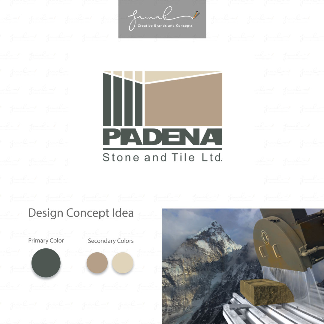
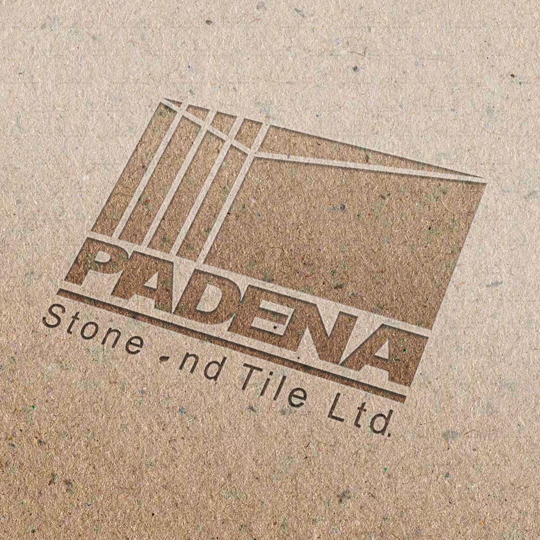
PADENA STONE LTD.
I designed the logo based on the client’s
business services “process of stone and tile.”
The logo represents a block of stone with cut edges.
Choice of colour was based on
the natural shades of stone in nature.
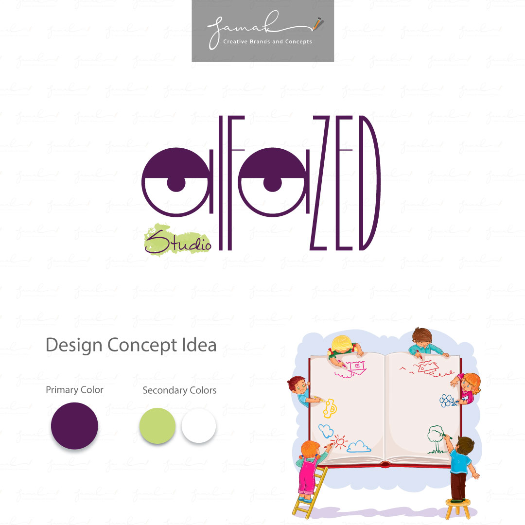
Alfazed Studio
Alfazed Studio is an animation studio based in Toronto, CANADA.
My creative client wanted to have an identity that transfers movement, lines, shape, and creativity.
You can see the thin and thick vertical and horizontal lines, circle and semi-circle shapes with the eyes’ movement that helps the audience understand the company services.
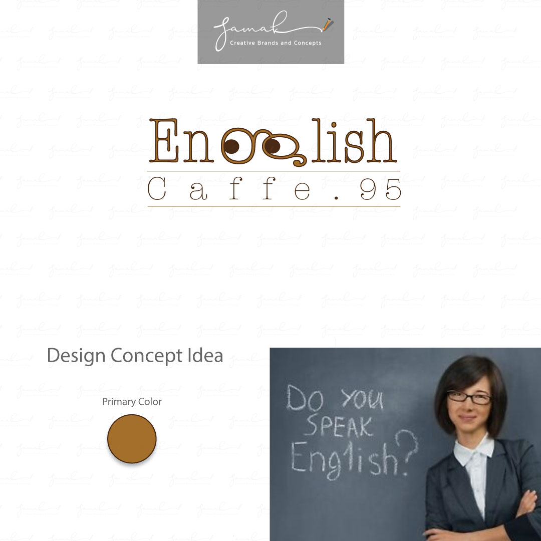
English Cafe
English Cafe is a private English class.
The lovely private English teacher was so creative and taught the lessons in a different method from others. By looking at the “g” letter in a new look design to representing reading glasses, you understand the creativity and differentiation.
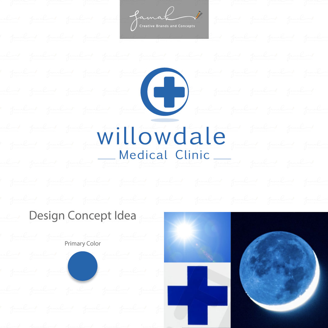
Willowdale medical Clinic
When the Sun, the Moon, and the Red Cross
help you create a 24 hours medical clinic logo.
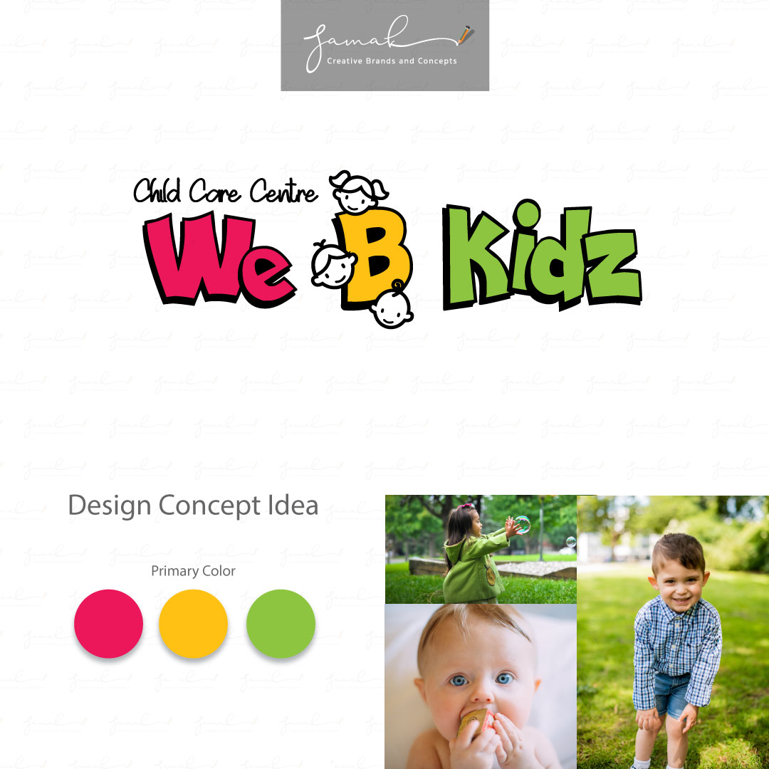
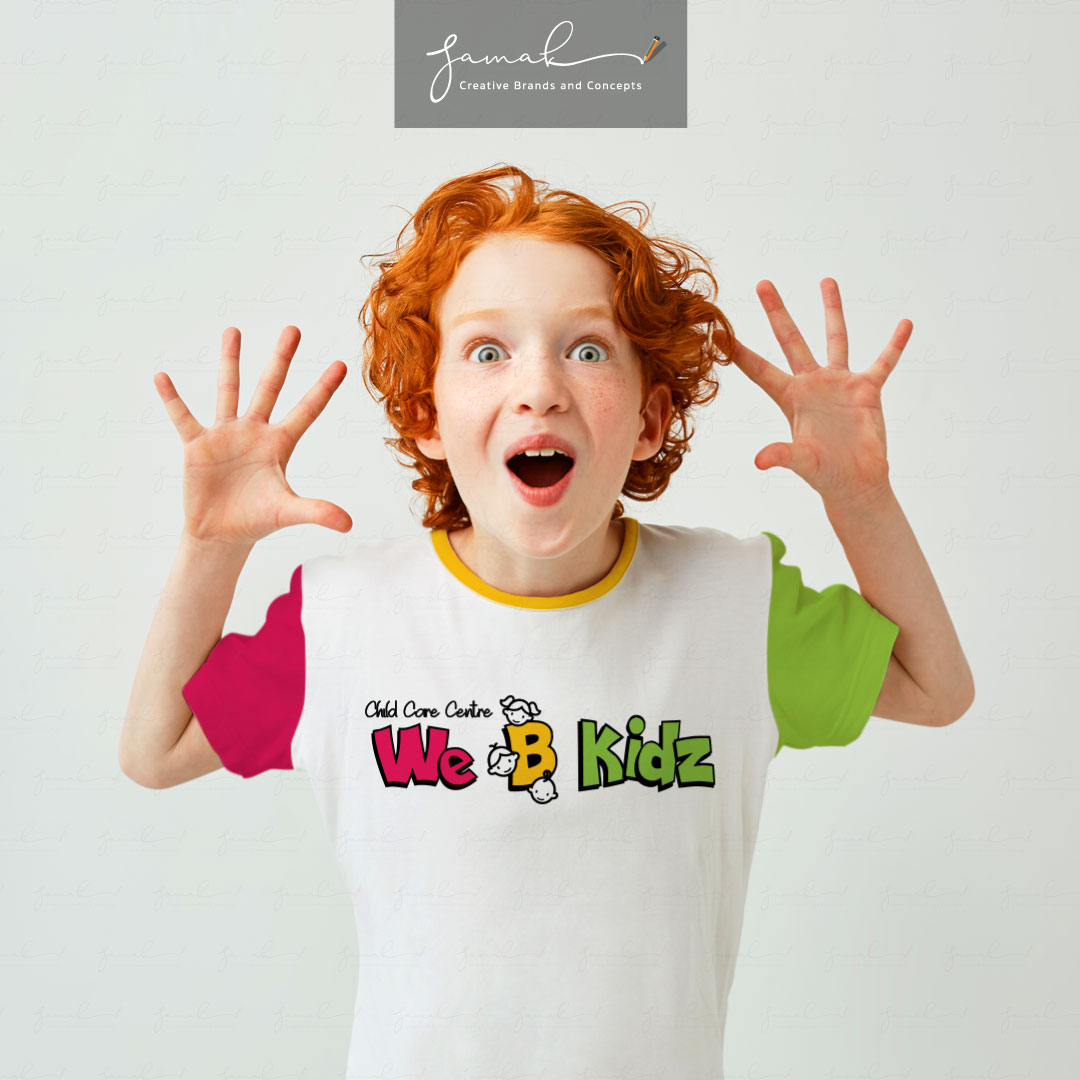
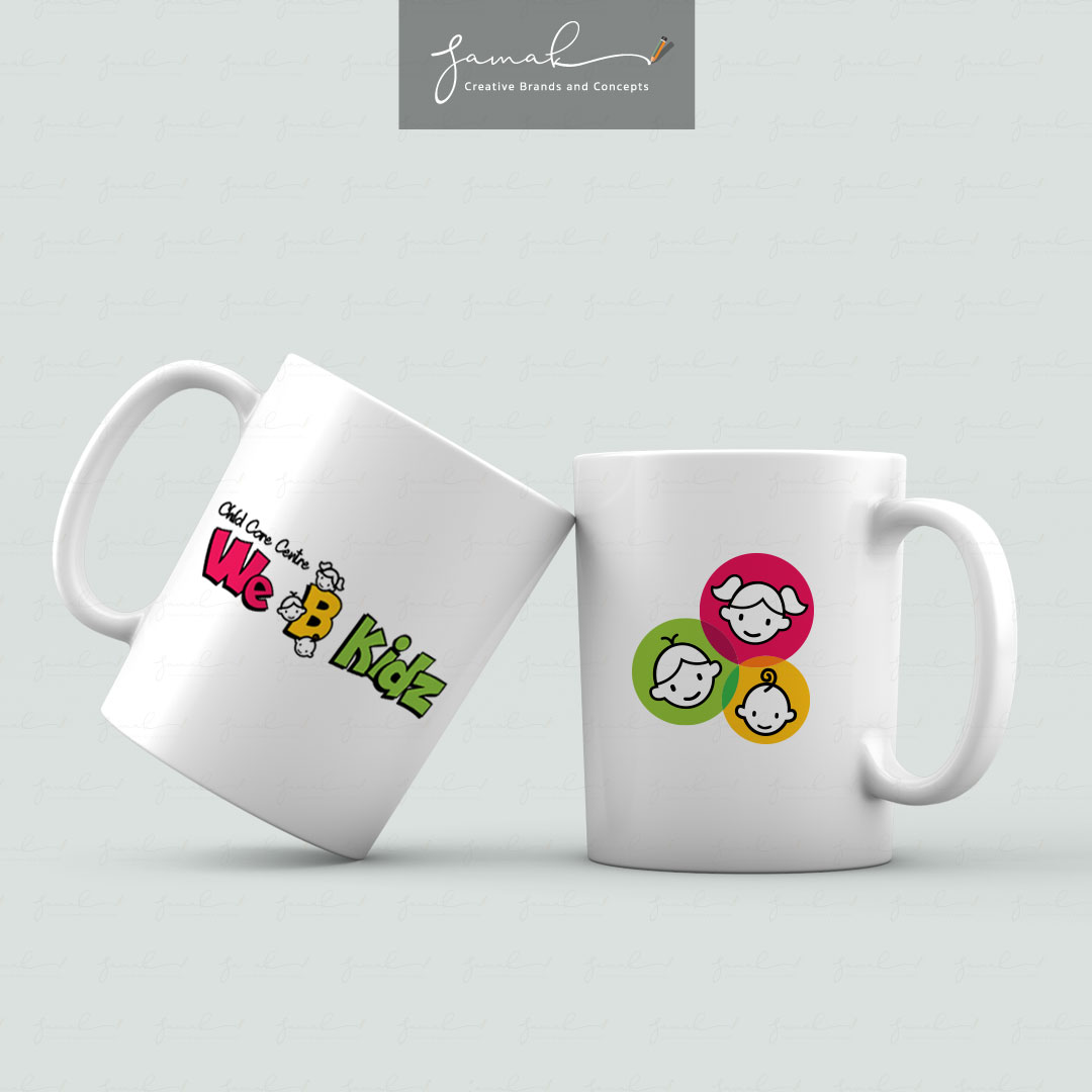
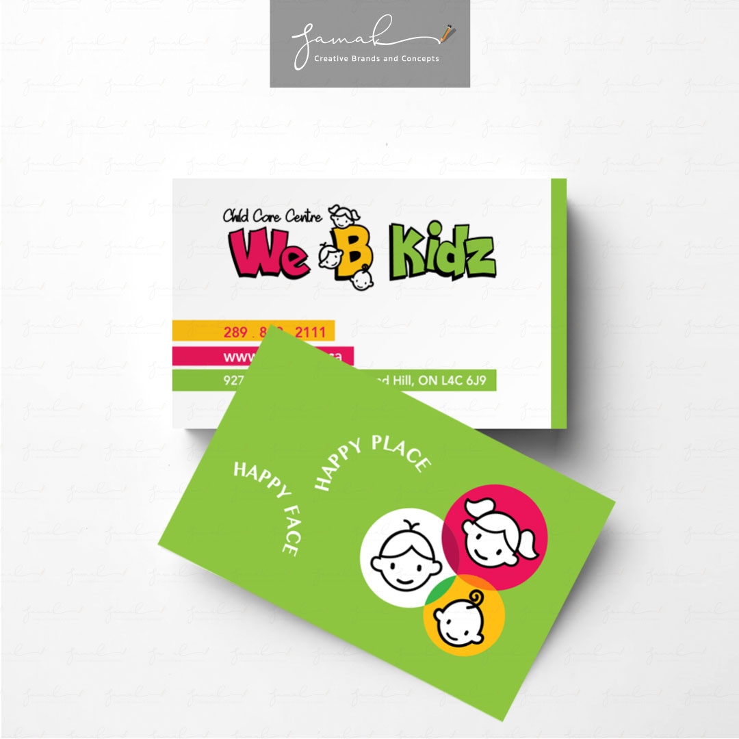
We B Kidz
We B Kidz is a licensed private daycare centre located in Richmond Hill, ON.
This fantastic place provides quality childcare services. The beautiful modern building has built by Urban Scape Architecture company.
We B Kidz daycare center came to me after ordering many logos from others. Through the many questions based on the goals and future perspective of the daycare, we stepped forward together, and I provided the identity that hit the goals.